Necroid
A downloadable game for Windows and macOS
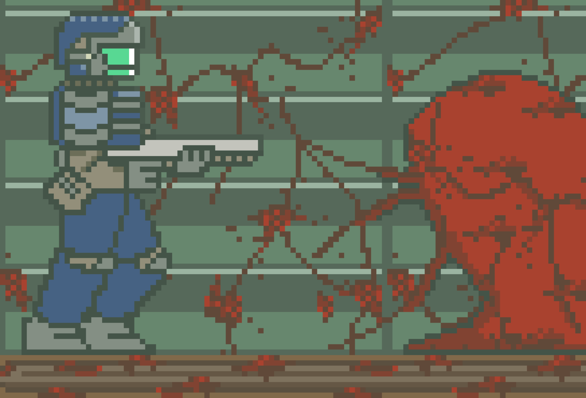
Necroid is our own rendition of a game inspired by Metroid. The player traverses through space to destroy the invasive Necron species that has slowly taken over the universe. It is up to you as the player to destroy these invasive parasites and save Earth before Earth becomes its next victim. Watch out, this time the Mother Necron has come to ensure that Earth’s downfall. Will you be able to stop the Necron’s before it is too late?
Contributors: Andy Chen, Nihal Rahman, James Sun, Soji Adenusi
Sound Citations:
https://freesound.org/people/Romariogrande/sounds/495389/ https://freesound.org/people/jalastram/sounds/221444/ https://freesound.org/people/Michel88/sounds/76957/
Non-menu screen music: https://karlcasey.bandcamp.com/album/dark-synthwave-collection-vol-2
Download
Development log
- PostmortemMar 12, 2022
- Development DevlogMar 12, 2022
Comments
Log in with itch.io to leave a comment.
I really enjoyed the game. I liked how the combat felt and I thought the wall jump mechanic was really nice. In the future I would add more places where the wall jump mechanic can be put to good use, I think its a strong part of the movement system.
I was really impressed by the wall jump, which makes the game unique from other platformer games. The artwork is really fancy and detailed, and I just can't help to replay again and again lol.
Wow, I must say this is really impressive! There is not much I can pick out to change/improve with this project which tells you how good this was. Maybe a suggestion I would have would be to probably change the background with stars to something a little less intense and distracting. Great job!
I can only imagine the work that was put into the art for this game; it looks amazing. The movement is smooth. To enhance the experience, I would recommend making the text in the corner larger and perhaps putting a background behind it (as opposed to using a bright color that contrasts the game).
The drawing of the character is really detailed. The running, jumping, shooting are smooth and the theme of the game is great. Most of the background looks very compatible with the theme of the game, and the drawing of the enemies are also very detailed and very suitable.
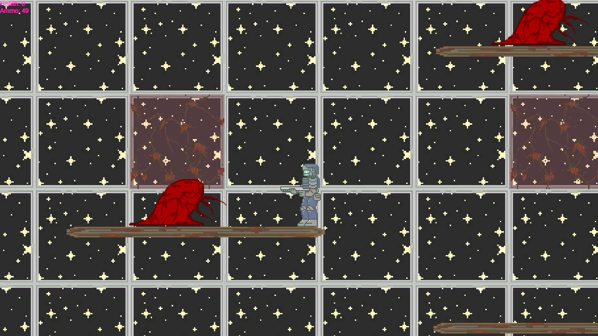
Some suggestions will be I am feeling a little bit dizzy when playing the level 2 because of its starry background. In addition, in level 3, I think the red enemy is not hurting the player. Also, some plates are moving so quick making it extremely hard to land.
The sprites of this game is so cool. The controlment of this game is comfortable. Different backgrounds matches different levels well, and the difficulty of each level just increases reasonably. If you can add more kinds of enemies, it will be greater!
I really like the theme! It reminds me of Dead Space and Metroid Prime! The enemy and level design is really awesome, its especially fun to do the modified wall jump! One thing I think that youre game can really benefit from is on certain levels when you have the starry background it can get a bit overwhelming! Otherwise its awesome!
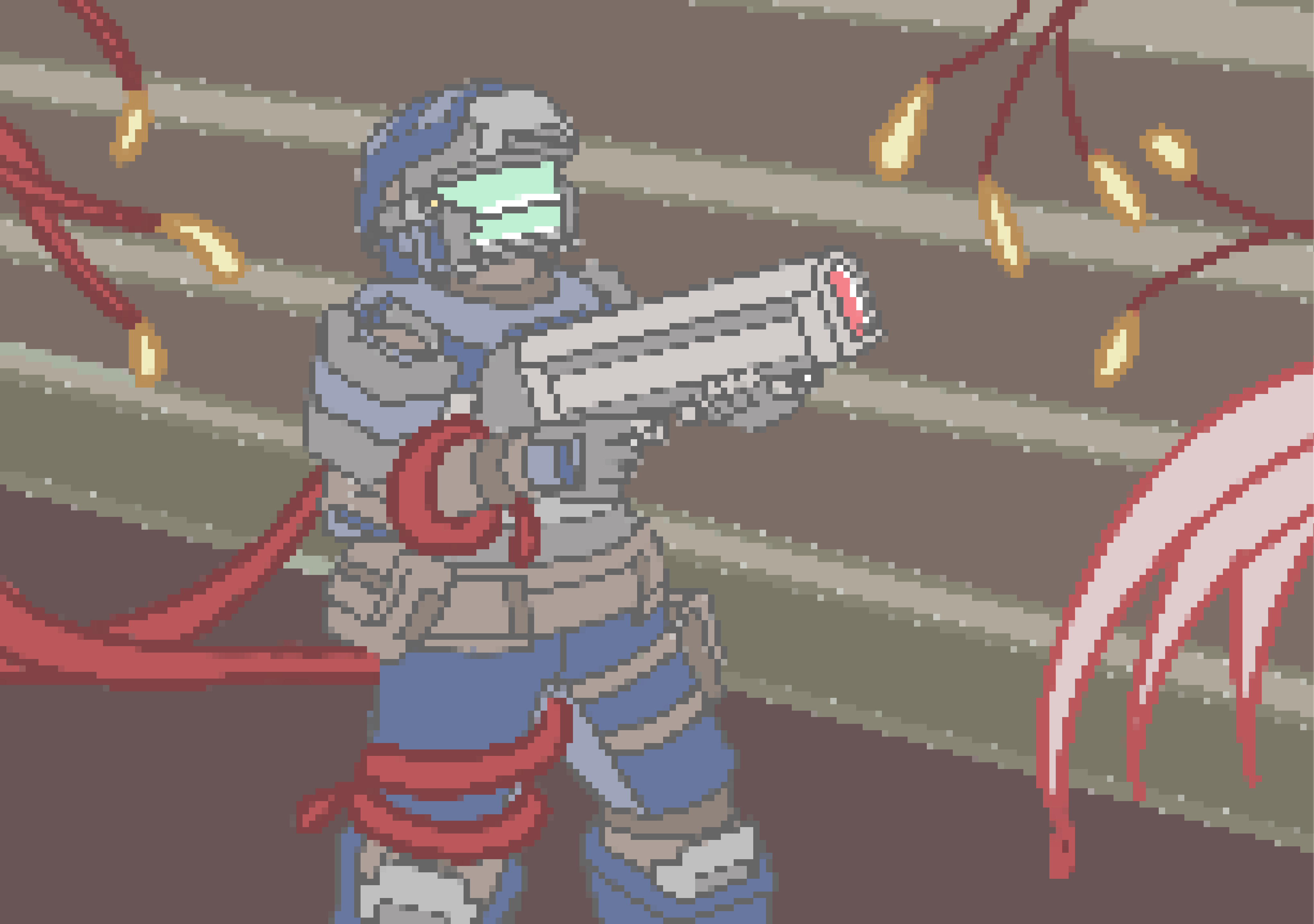
I really love the character sprite! The subtle lens flare on the idle animation is a small, but very cute detail that makes the character feel alive. The UI at the top left could be bigger and a SFX or visual on the character to show that we ran out of ammo would be nice as well. The artwork for the level design are very unique as well, but the level with the stars in the background hurts my eyes when moving through it.
I love the animations/sprites for this game. They are super developed for both the player and the enemies. Something minor with the sprites is that the shades of the player are light, same with the background. Darkening the hue more could make the player pop more like the enemies. Other than that all the levels and the music are super impressive! Great game!!!
This game is super impressive, from the artwork, sound, to the gameplay. I love the character's animation with different actions and the themed background of each level. It is very cohesive and put together. In terms of gameplay, everything felt smooth, and the difficulty level was designed well as you level up.
I like the art style of the game and the visuals are well done. The sound effects and background music also work really well with the theme of the game. I think something that could be improved is the UI that shows health and ammo. It is currently pretty small and difficult to see. I think making it bigger would help or even adding some kind of visual element to replace it.
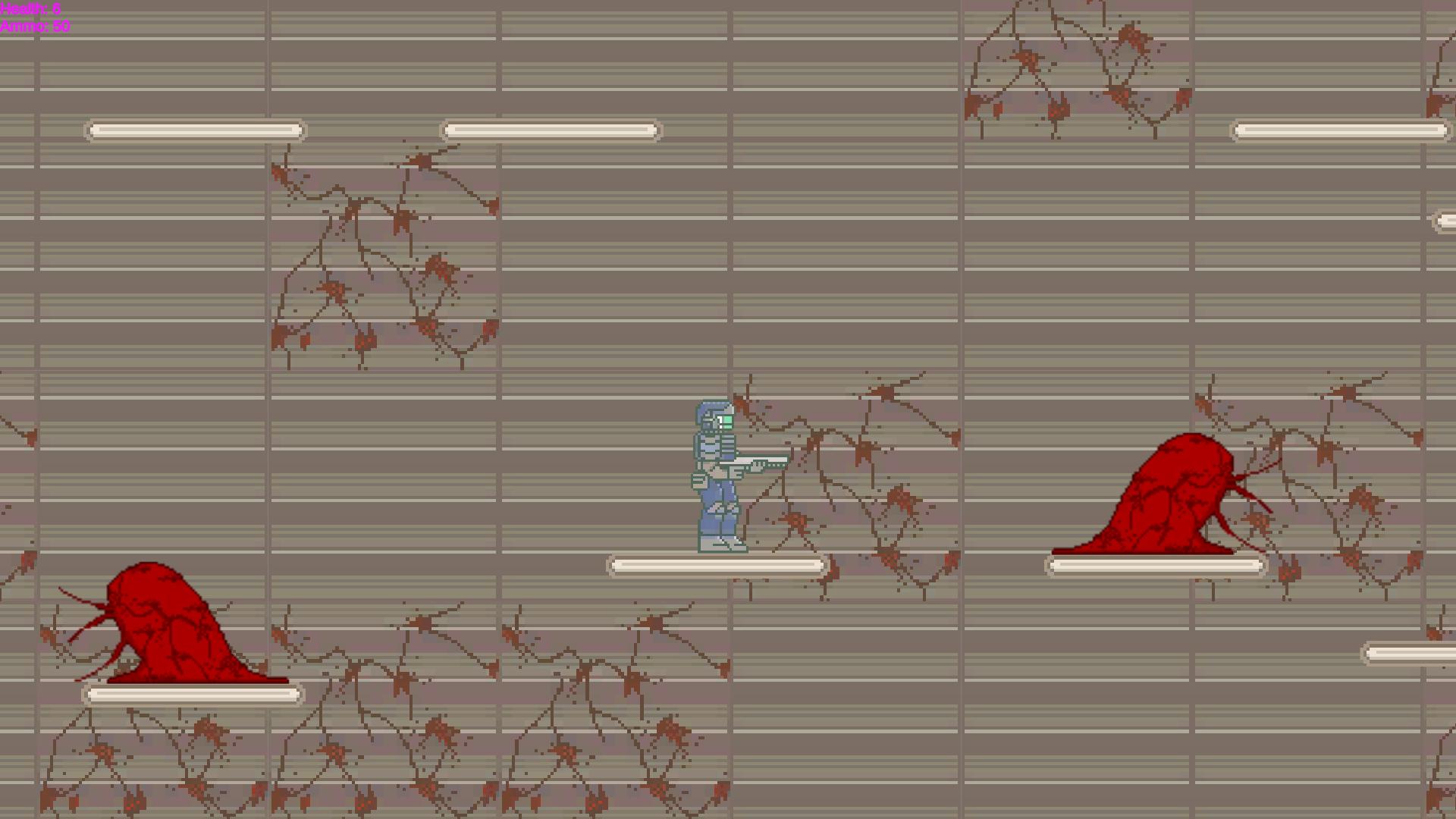
First of all, I really like the artwork you guys made for the title page, which clearly points out the topic of your game and gives players the tension for the unknown battle and enemies. For the game content, I like how you increase the game difficulty with the moving platform the climbable wall. The boss fight idea is unique, and I really appreciate that.
I really appreciated the cohesiveness of this game - from the artistic style of the sprites and animations to the sounds, the game felt very well put together. Each level flowed smoothly from one to another and the change in sounds/effects gave a professional polish to the game as a whole. One thing I feel could be improved is the color scheme of the backgrounds as their patterns made it a bit difficult to view the player himself (who is lighter in color) but overall, incredible job!
I think the art style for this game is pretty neat. I like the pastel colors used. It gives it a very retro feel. I do think though that the game maybe should make the star background more pastel so it's easier to see the player. I also think the ground on the first level should just look more like a platform. Besides that I liked the game though!
The game was very polished and paid homage to the Metroid series very well. I like how the sprites for the player resembles Doomguy. The background and enemies were also fitting to that of what fighting aliens as a space soldier would be like. I do find the background with the stars and pitch black sometimes is distracting when trying to move around. Despite this, the game was fun to play and is really nice to see Doomguy in 2D!
I was already impressed during the beta testing but the final version is on a completely different level. I like how the different levels gradually introduces players to more and more mechanics. The wall jumping was cool and I liked how there was a final boss at the end.
The sprite work is seriously amazing in this, especially the cover art! The colors melt into each other really well, and the music also goes great with the overall theme of the game. I think the star tiles might be a little bit too dark compared with the more muted player sprite, as I was having trouble seeing it properly. Overall, great job!
I like the abundance of creativity in the concept and the drawings of the sprites because it’s so intricate for both the enemy and the player characters. The sounds used in this game are really cool. I think the game could be improved to make the user experience more immersive by adding UI in place of health and ammo.
I really liked the character and monster sprites and the music. But sometimes the continuous black star background kind of confused me because I wasn't able to follow the player as well? Other than that, real cool game!!
I really like the sprites and background, they are so elegant and monsters are really cool. The sound effect is also really attractive. It would be more fun to have a shooting animation for further improvement. Really like the game!
Bro, the music, the pixel art, and of course the gameplay, this is really nicely done. Great job bro bro.
I really like the sprites and sound effects. I thought the effects really immersed you into the game. The changing However, I thought the background with stars like level 2 was kind of distracting and I couldn't focus on the character. I also thought the platforms with the fast speed was really cool.
I think my favorite part of this game would be the sprites. It looks extremely anatomically correct, and the color palette is very cohesive. I think the mobs look really fun too, and I like how you made them red so it is easy to tell that they are bad! I think the cover art cinematic was a great touch, might steal that idea... Would love to see the artists other work too!
really nicely done sprites and animation! Especially the monster's sprite was very realistic and I also love the image on the starting screen, looks like production quality. Good job!!